Hugo Images Lazyload
For blog sites that are not optimized for mainland China, image lazy loading is almost a must-have feature that can effectively improve the first screen speed of a page. There are many lazy loading solutions for static sites, but all of them inevitably bring layout offset problems that affect the CLS score (opens in a new tab) of the page.
In this article, we will implement lazy loading of images and adaptive CSS image placeholders for different scales based on browser native lazy loading and the Golang html/template template engine used by Hugo.
Lazy loading implementation
There are many ways to implement lazy loading of images. A long time ago there was the jQuery-based Lazy Load (opens in a new tab), which is hardly used anymore with the retirement of jQuery; later there was the native Intersection Observer API (opens in a new tab) implemented by vanilla-lazyload (opens in a new tab), which can essentially conform to the needs of lazy loading.
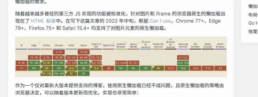
As more and more of the functionality once implemented in third-party JS was standardized, browser-native lazy loading for images and iframes appeared in the HTML Standard (opens in a new tab). As of mid-2022, native lazy loading of image elements is supported in Chrome 77+, Edge 79+, Firefox 75+, and Safari 15.4+ according to Can I use (opens in a new tab).
As a blog that only provides support for the latest major releases, using native lazy loading is no longer a problem, and the native lazy loading policy is determined by the browser, can be optimized with version updates, and is very simple to implement: the
<img src="https://example.org/img.jpg" loading="lazy" alt="Lazy Image" />Layout Offset Problem
Any image that is loaded lazily is bound to have a layout offset problem. Before the image is loaded, the image occupies a height of 0, while after the image is loaded, the image occupies a height that may change, resulting in a layout offset.
The conventional solution to the layout offset problem is as follows, taking a full-width image as an example.
- place the
imgelement in the two-leveldivcontainer - set the
positionproperty of the outer container torelativeandwidthto100%. - set the
heightof the inner container to0andpaddingto the image aspect ratio - Set the placeholder background color for the outermost container
.fiximg {
  position: relative;
  display: block;
  overflow: hidden;
  background-color: var(--color-wrapper);
  width: 100%;

  &__container {
    display: block;
    width: 100%;
    height: 0;
    margin: 0;
    padding-bottom: '<ASPECT RATIO HERE>';

    img {
      display: block;
      width: 100%;
      margin: 0;
      color: var(--color-primary);
      font-size: inherit;
      text-align: center;
    }
  }
}
However, for blog posts, the aspect ratio of the inserted image is indeterminate, so fixing the aspect ratio will have a very general effect.
Go HTML Template Implementation
This site's static page generator Hugo uses Golang's html/template template engine to implement templates.
The image resource structure of this site is decentralized. For each article, Hugo has the concept of page resource (opens in a new tab), i.e. the resource file in the same directory as index.md of each article is considered by Hugo as a resource specific to that article.
Hugo allows customization of the rendered HTML through the Markdown Render Hooks (opens in a new tab) method when rendering inserted images, so the main implementation is done here.
First create the layouts/_default/_markup/render-image.html file and get the image resource.
{{ $image := .Page.Resources.Match .Destination }}
{{ if ge (len $image) 1 }}
{{ $image = index $image 0 }}
{{ else }}
{{ warnf "Image not found \"%s\"" .Destination }}
{{ end }}
After getting the image, parse the width and height of the image and multiply the width and height by 1.0 to convert it to a floating point number:
{{ $imageHeight := mul $image.Height 1.0 }}
{{ $imageWidth := mul $image.Width 1.0 }}
{{ if or (lt $imageHeight 1) (lt $imageWidth 1) }}
{{ warnf "Image not valid \"%s\"" .Destination }}
{{ end }}
Subsequently, the aspect ratio of the image is calculated based on the width and the inline style for the bottom padding is generated as follows
{{ $ratio := mul (div $imageHeight $imageWidth) 100 }}
{{ $css := printf "padding-bottom: %.4f%%;" $ratio }}
Finally, depending on the image width, set the full width for the large image and the original width for the small image, and output the HTML as follows
{{ $width := "width: 100%;" }}
{{ if le $imageWidth 652 }}
{{ $width = printf "width: %.0fpx;" $imageWidth }}
{{ end }}
<!-- goldmark will insert p tag before & after image div so theres no need to wrap it with p tag -->
<div class="fiximg" style="{{ $width | safeCSS }}">
<div class="fiximg__container" style="{{ $css | safeCSS }}">
<img loading="lazy" src="{{ $image.Permalink }}" alt="{{ .Text }}" />
</div>
</div>Preview
Take this post as an example, before lazyloaded:
After lazyloaded: